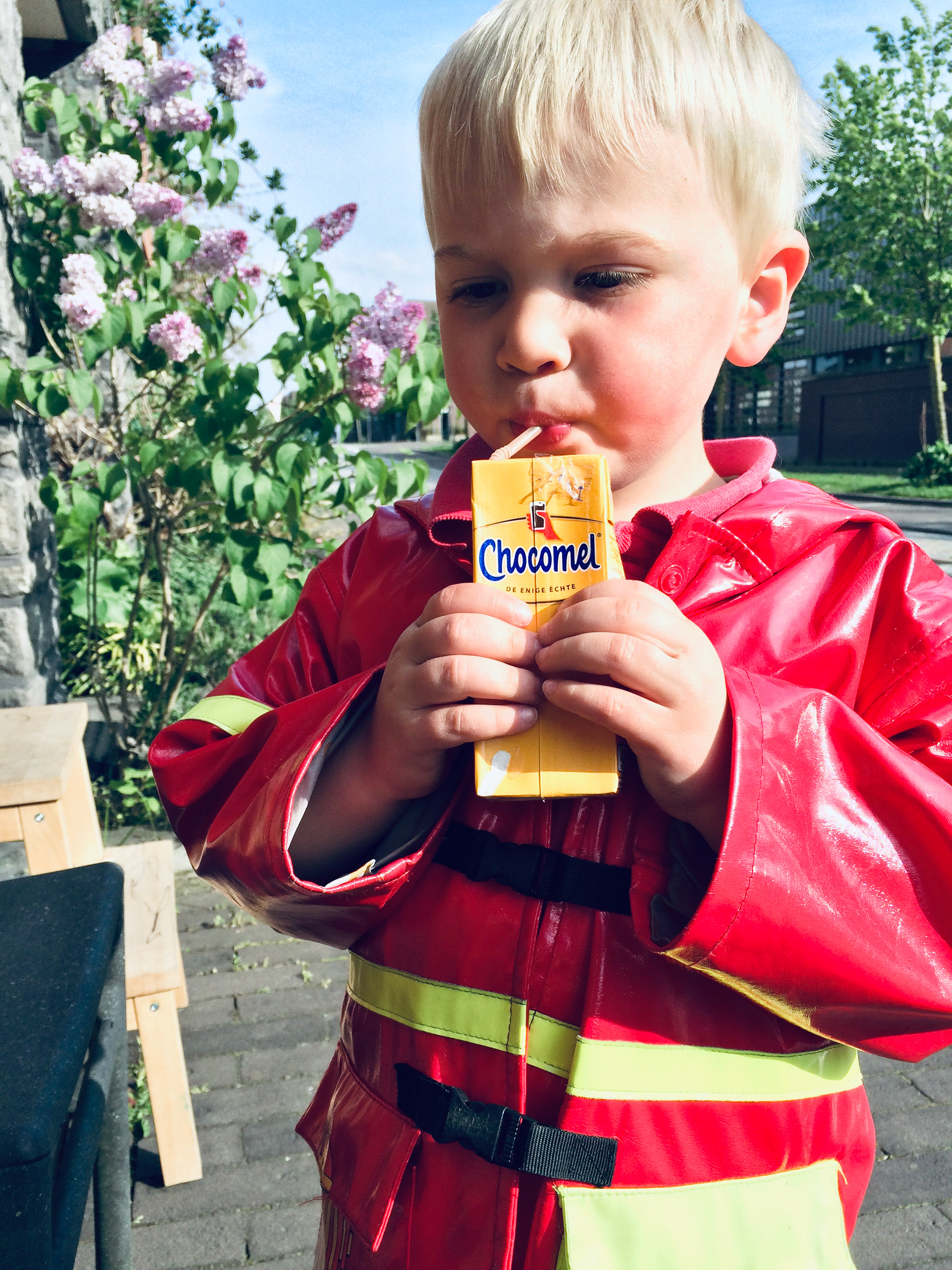
Kids not just ask for a chocolate milkdrink, they want Chocomel. A great position for a brand that completely owns a category.
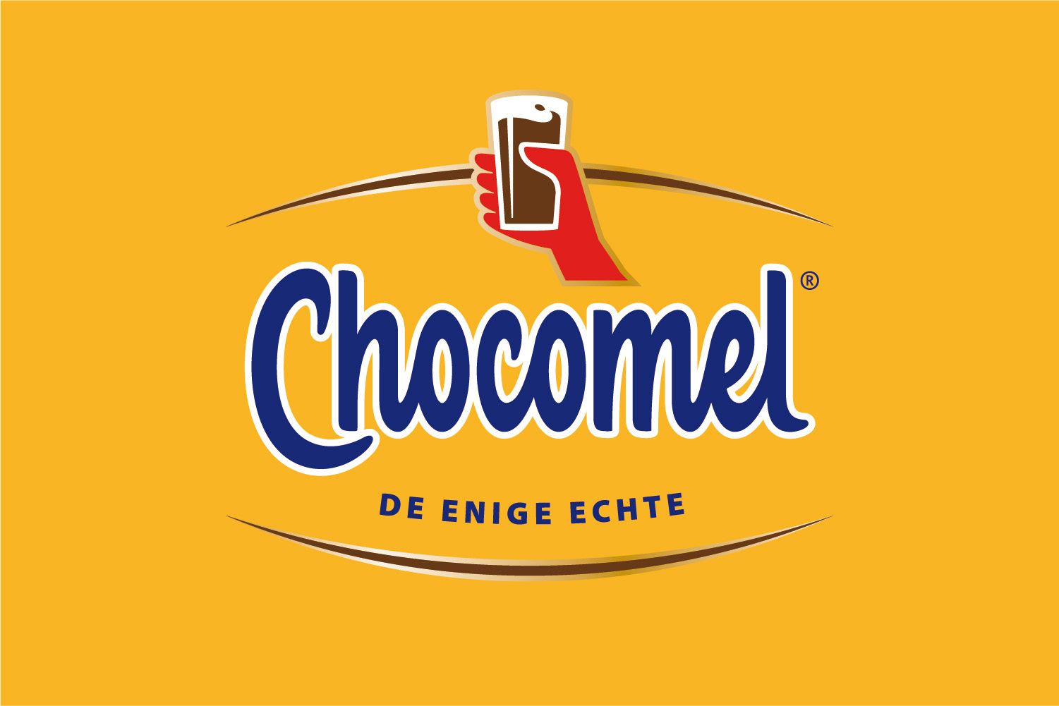
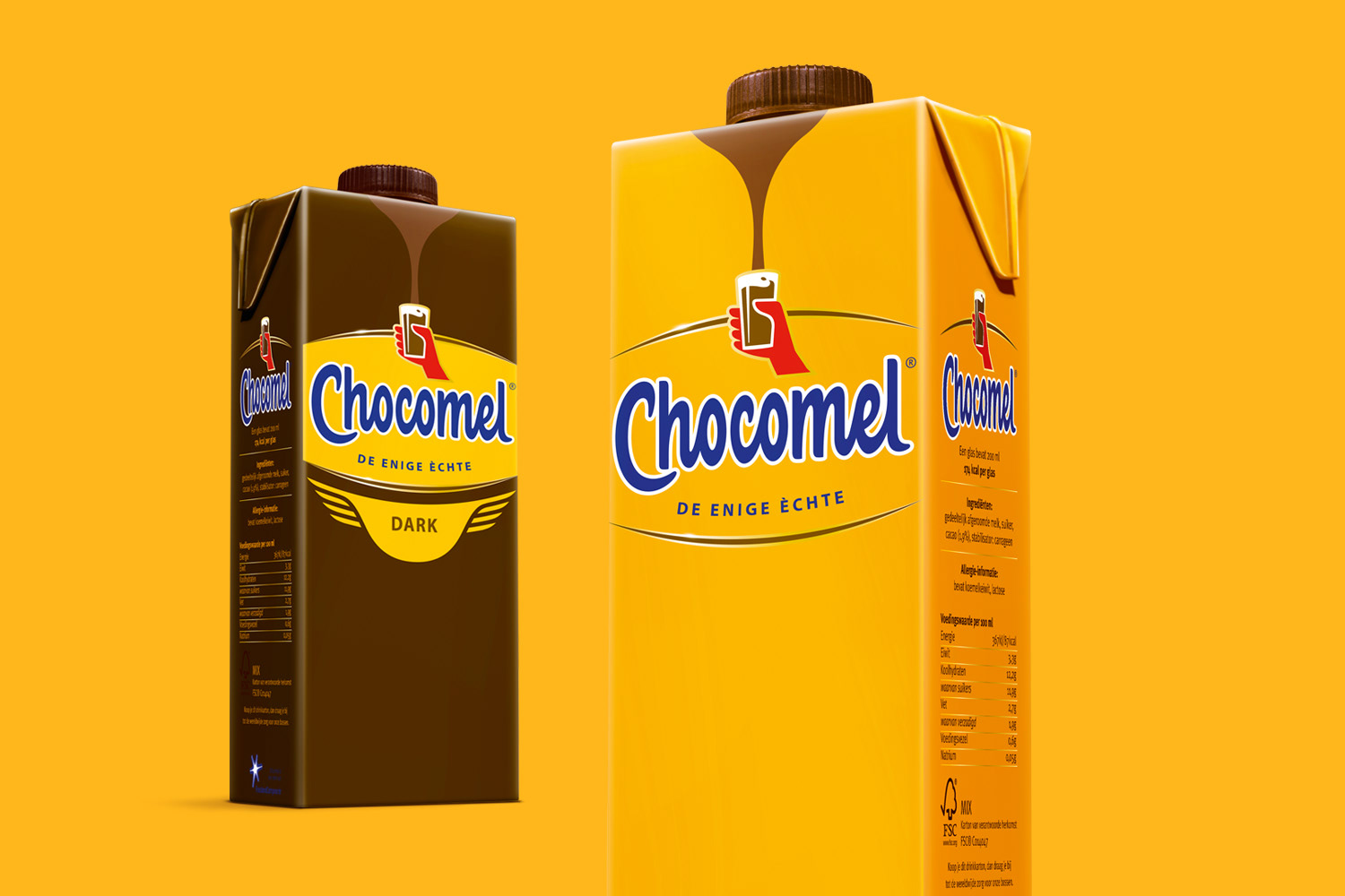
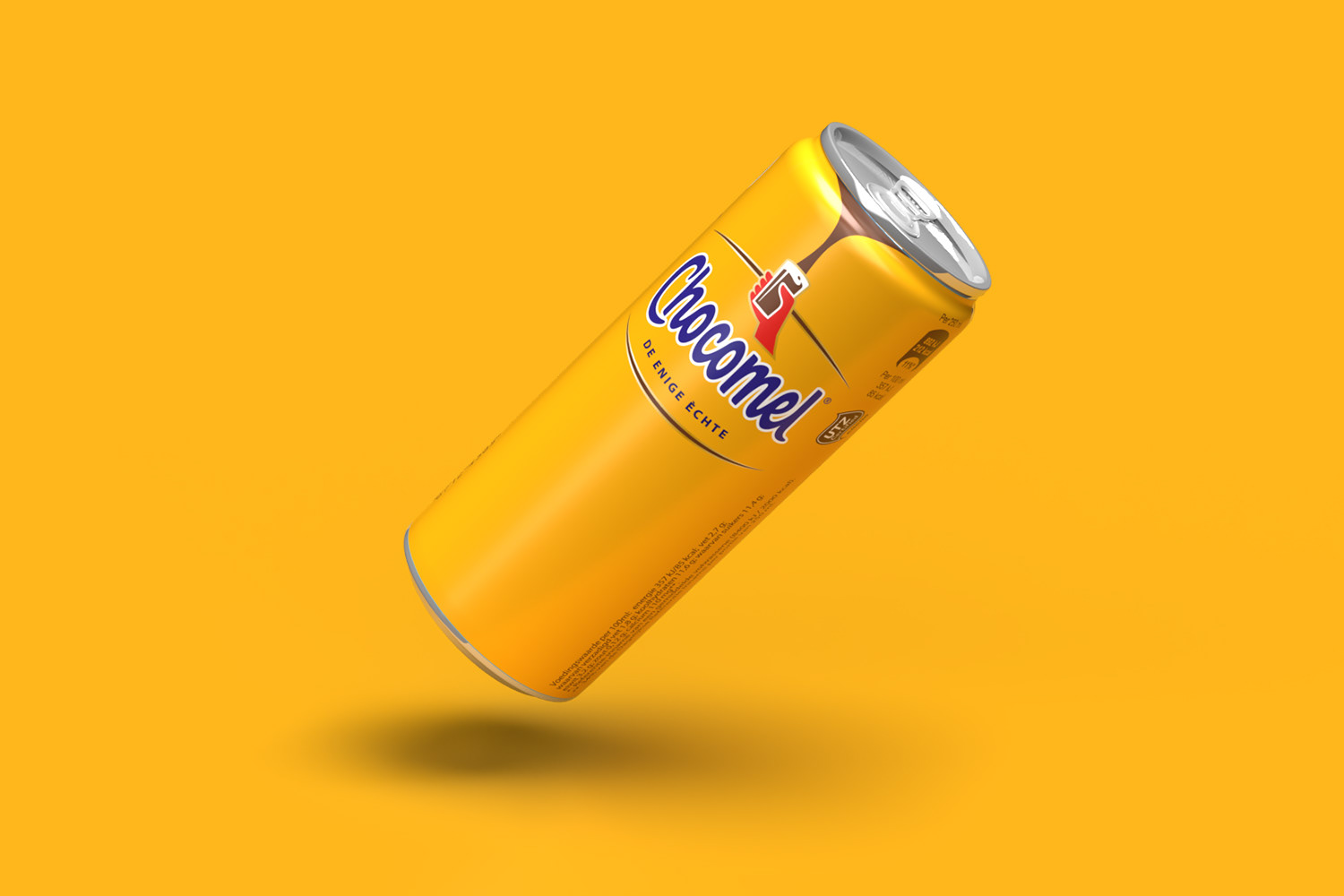
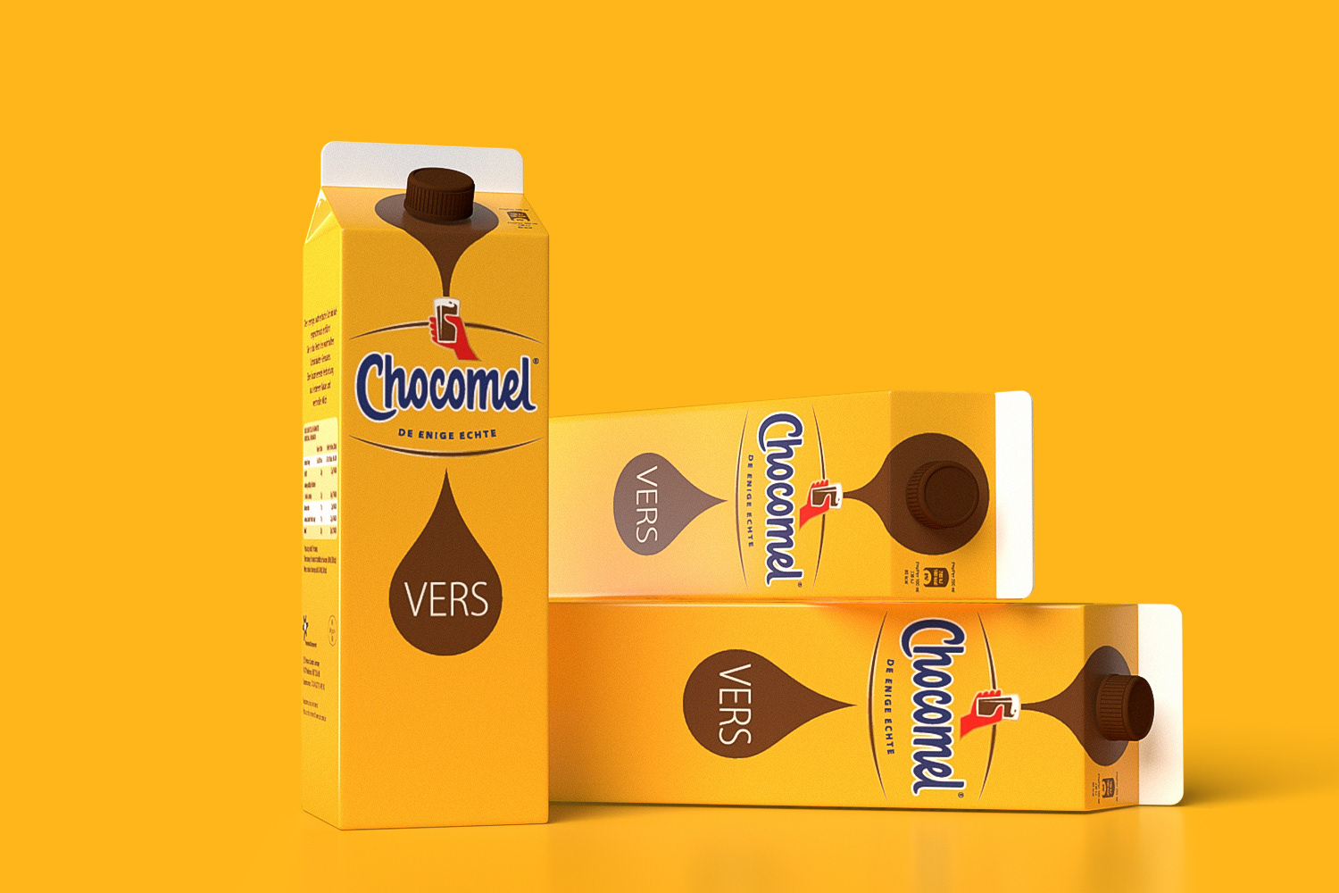
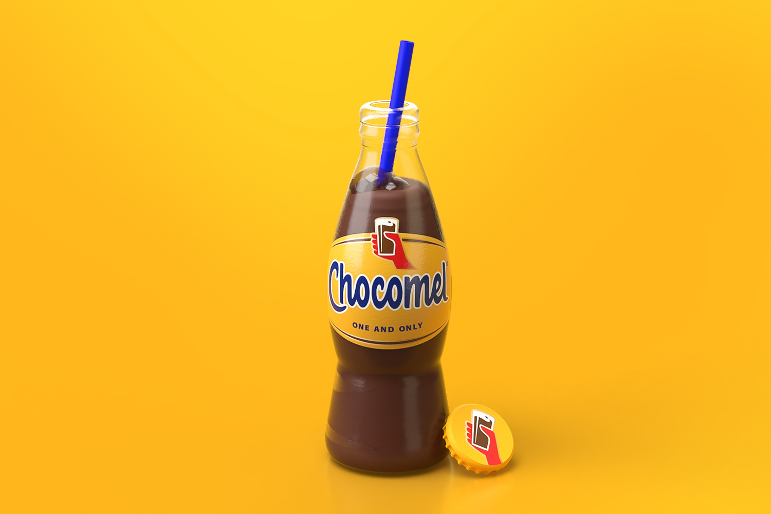
To push Chocomel into a 'premium' brand, we revamped the brand with a brighter yellow, a distinct redrawn icon and golden-brown arches to fit an international stage.
‘The poor’ was added as a subtle design cue — echoing the endless longing for chocolate.
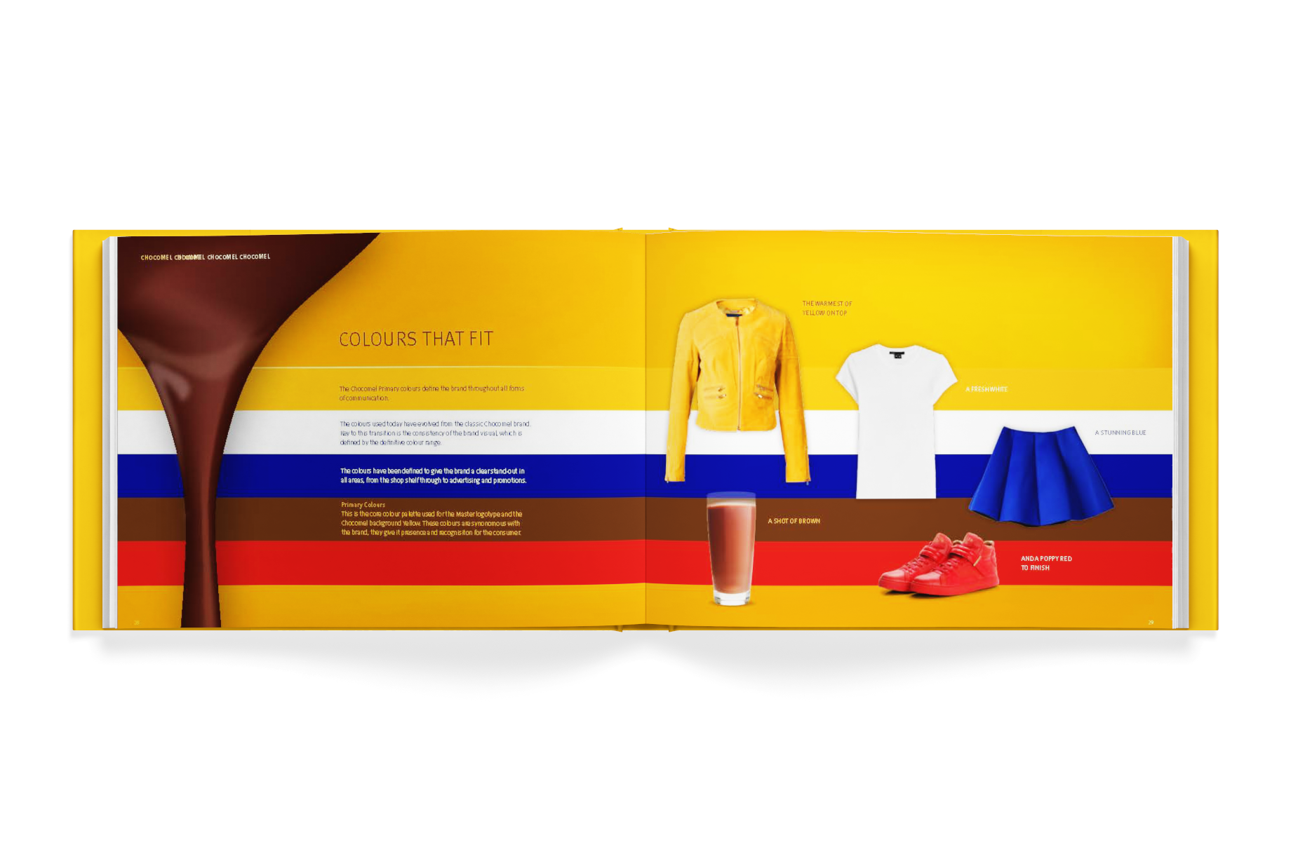
A brand like Chocomel stands out from the crowd: that rich yellow color, the playful tone of voice, the warm, full feeling. That’s no coincidence. It’s the result of a strong brand guide.
A good brand guide ensures that every element of the brand – from packaging to campaigns – shares the same flavor: recognizable, consistent, and 100% Chocomel. It’s the recipe that makes sure everyone who works with the brand speaks the same language and creates the same experience.