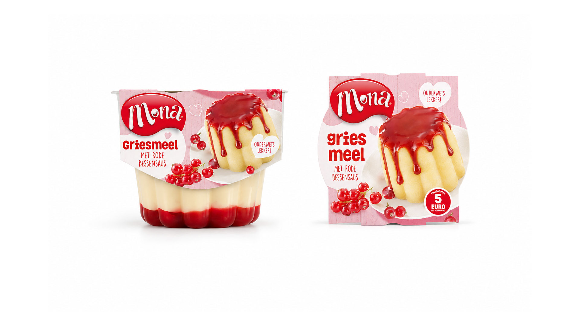
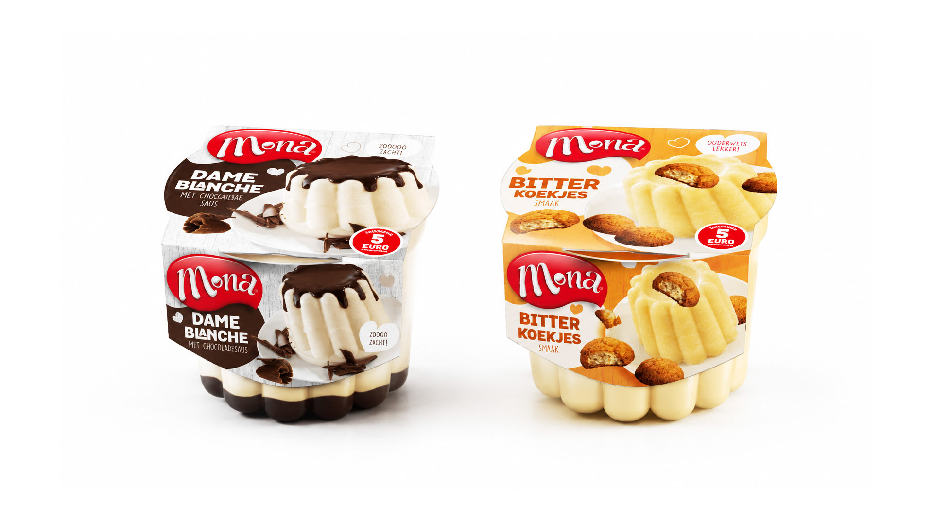
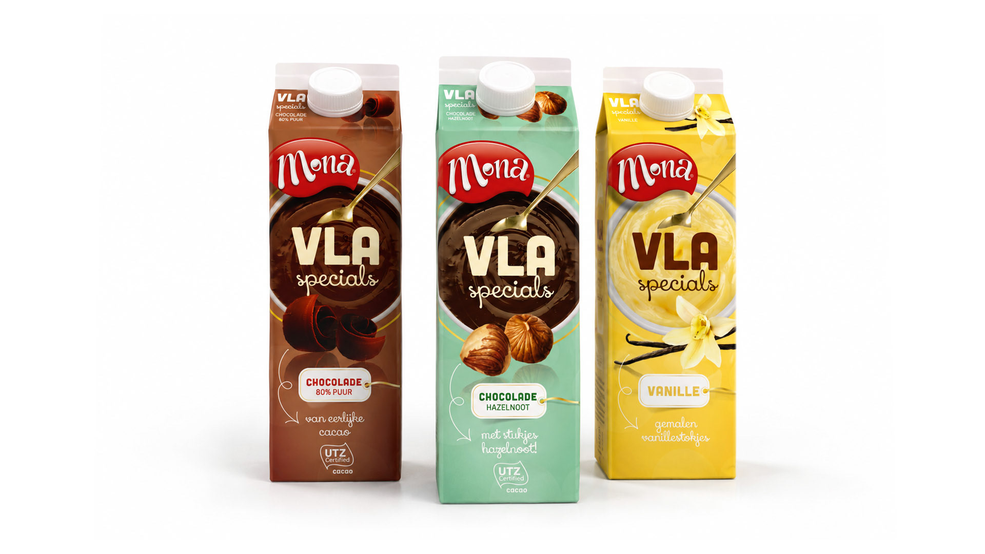
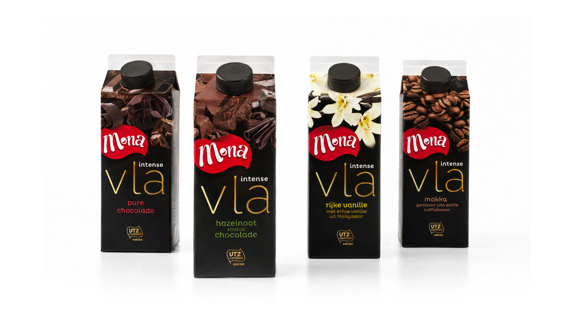
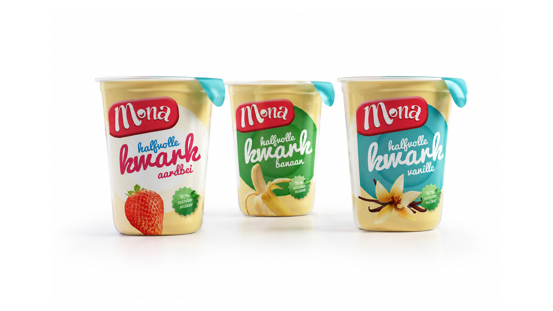
Holland's most favourite dessert needed a rebranding for more shelf impact in retail environments. The color Red is the new claim to fame, the Jester their archetype.

The logo is 'all-in-one'. The wobbly pudding, the smile of the enthusiastic claim (that makes you happy!) and the powerful jestercolour 'red'.
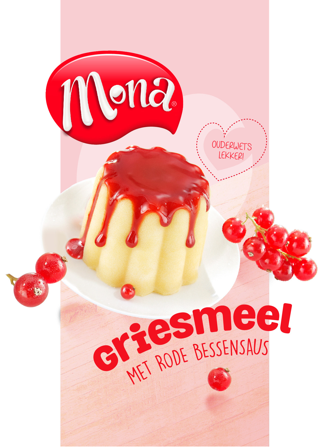
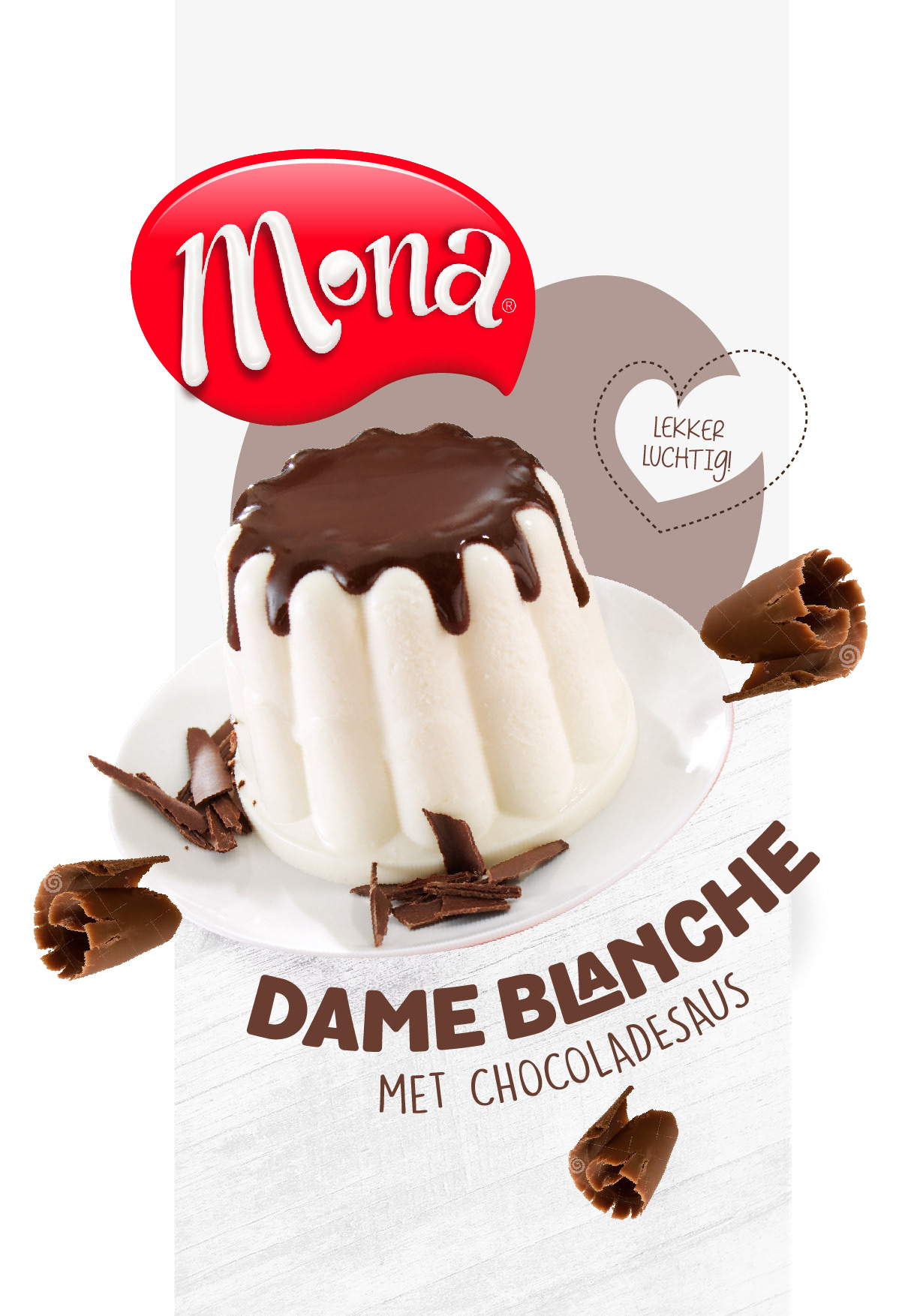
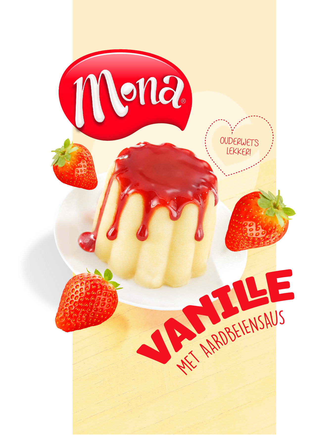
The logo has a device to stand on. A splash of joy that stands out on every design and creates shelf impact.